The “Heatmap” is available on Ad-Hoc reports. The Heat Map feature will ad color to the data set in order to better illustrate material differences in the data presented. In other words, rows and columns with the most change across years or data categories.
Below is an illustration. The Heat Map can be toggled on and off. Also it can be inverted or adjusted if desired.
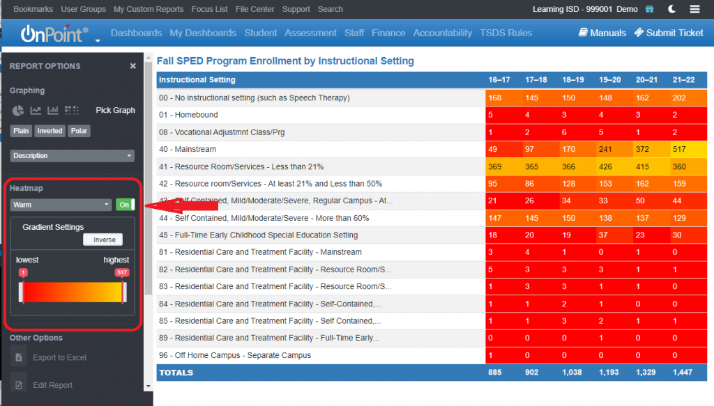
*Heat map settings do not transfer to Excel if you export your report.
The following URL guide to creating Heat Maps in Excel may be used as a reference to add a Heat Map after your report is converted to Excel: https://www.excel-easy.com/examples/heat-map.html