The Impact Group to State Report answers the question, “Was the performance of my students statistically significantly different from the rest of the population in the state?” And if so, “What was the effect or the impact of that difference? In other words, did implementing something (i.e special program, tutorial, intervention, or software system) impact overall student performance?”
The use of inferential statistics in educational settings allows us to make strategic decisions based on data. We avoid guessing, speculating, and listening to the squeaky wheels about what is effective, what is not, what should stay in the budget, what should be eliminated, what should be added or expanded, and what should be changed or modified. Inferential statistics provided by OnTarget’s STAAR Impact Reports go a long way toward supplying the foundation for smart decisions.
Below is an overview of each of the components within the report:
The report begins by outlining the State Mean (average) Raw Score and Standard Deviation and compares it with the Selected (Grade Level / Subject Area) Mean Raw Score and Standard Deviation.

In this instance, the raw score mean for the state was 24.91 with a SD of 8.36, while the selection yields a raw score mean of 29.37 and SD 7.16. These scores indicate that the raw score mean of the selection was higher than that of the state population and the spread of the scores or the standard deviation was closer to the mean.
A small Standard Deviation indicates that the scores are closer to the mean;
while a large Standard Deviation shows that the scores are more spread out and further away from the mean, indicating more variation or a larger spread of the scores.
Typically, true higher performance is indicated by a high mean and a small standard deviation.
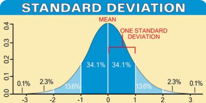
The figure below depicts the percentage of the population that falls within each standard deviation. Notice that the mean is identified by 0 and is located in the center of the normal curve. One standard deviation on either side of the mean represents 34.1% or for both +1SD and -1SD would equal around 68% of the population.
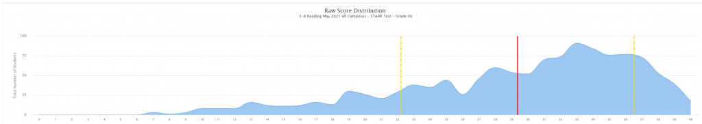
The graph below shows the frequency distribution of the scores for this district (Raw Score Mean 29.37, SD 7.16). The red line indicates the Raw Score Mean (29.37) and the yellow line shows 1 Standard Deviation (7.16) above and below the mean. The area between each of the two yellow lines denotes where 68% of the population scored on this particular test, i.e 68% of the students scored between the raw scores of 22 and 36 with a mean of 29.37.
The table below outlines the findings from the statistical analysis that is calculated within OnTarget.

This report answers the question “Was the performance of my students statistically significantly different from the rest of the population in the state?” In this instance, we want to know if a program, tutorial, intervention or software system implemented in grade 6 reading impacted student performance and if it did, what was the effect of that difference? In other words, were the 2021, 6th Grade Reading Raw Scores, at this district, who participated in some type of program (intervention, tutorial, software) statistically significantly different (Raw Score Mean of 29.37 SD 7.16), from the rest of the 6th grade population (mean raw score 24.19 SD 8.36) who didn’t participate (intervention, tutorial, software), and who took the STAAR test in Texas during the 2021 school year.
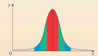
The answer to this question is located in the graph below. If the scores (State Mean Raw Score 24.19 SD 8.36) and the (District Mean Raw Score 29.37 SD 7.16) were NOT statistically significantly different, then the observed score results would fall within the more likely observation or the center of the normal curve. However, if the scores (State Mean Raw Score 24.19 SD 8.36) and the (District Mean Raw Score 29.37 SD 7.16) ARE statistically significantly different, then the observed score would fall outside of the center of the normal curve in the very un-likely observation or “rare” zone. Each normal curve contains 2 rare zones and they are indicated on either side of the yellow line. This graph identifies to which side this critical value fell. In this instance, this was statistically significantly different, and it fell to the positive side of the mean.
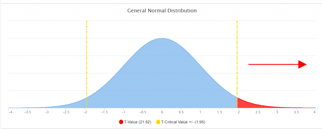
Within this example, the resulting t-critical value was greater than 1.96 indicating that for the State Mean Raw Score 24.19 SD 8.36 and the District Raw Score Mean of 29.37 SD 7.16) ARE statistically significantly different.
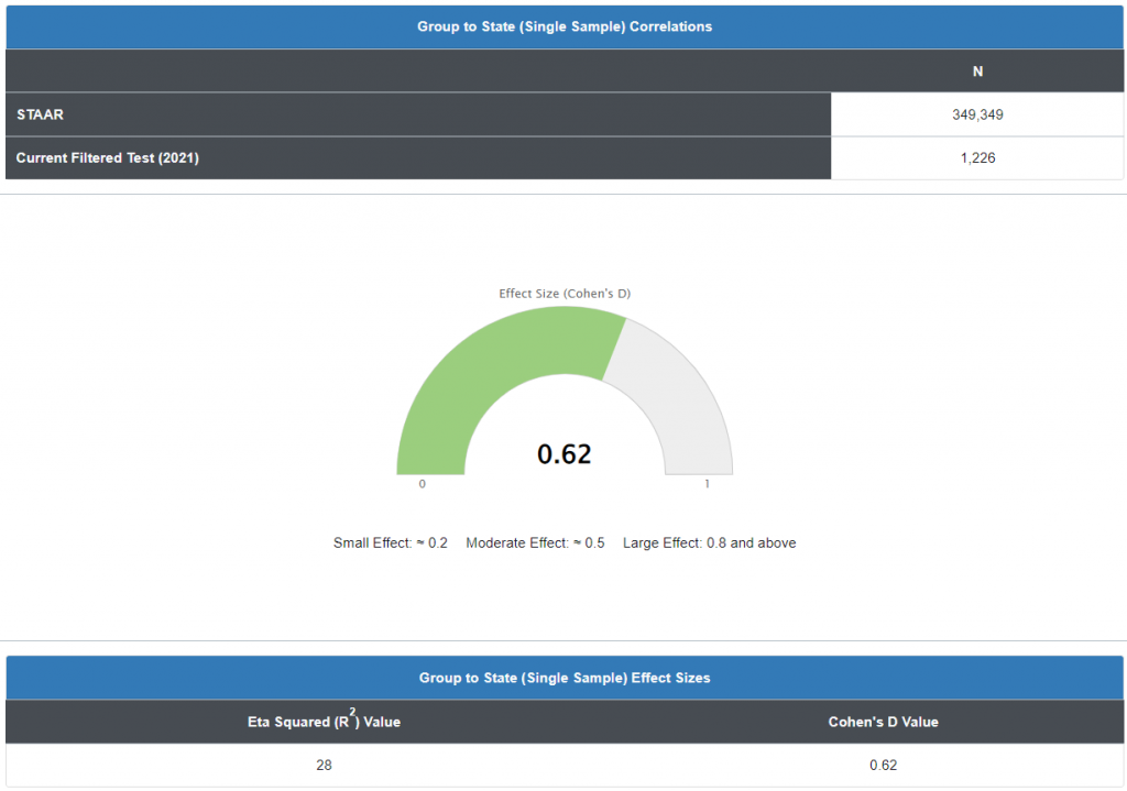
The second question, if they are statistically significantly different, “What was the effect or the impact of that difference?” The next graph analyzes the effect size of that difference using another inferential statistic called a Cohen’s D, or standardized mean difference, one of the most common ways to measure effect size. An effect size is how large an effect is. For example, medication A has a larger effect than medication B. In our example, the previous graph indicated our mean was statistically significantly different from the state population, indicating an effect, it didn’t calculate how how large that effect was.
It is important to note, Cohen’s D works best for larger sample sizes (> 50). For smaller sample sizes, it tends to over-inflate results. Therefore, if your analysis includes a small sample size, the use of a correction factor is advisable.
In our example, data reported in the graph indicates an effect size of .62 (d=.62). So is that good or bad? A d of 1 indicates the two groups differ by 1 standard deviation, a d of 2 indicates they differ by 2 standard deviations, and so on. Standard deviations are equivalent to z-scores (1 standard deviation = 1 z-score).
If you aren’t familiar with the meaning of standard deviations and z-scores, or have trouble visualizing what the result of Cohen’s D means, use these general “rule of thumb” guidelines (which Cohen said should be used cautiously):
- Small effect = 0.2
- Medium Effect = 0.5
- Large Effect = 0.8
“Small” effects are difficult to see with the naked eye. For example, Cohen reported that the height difference between 15-year-old and 16-year-old girls in the US is about this effect size. “Medium” is probably big enough to be discerned with the naked eye, while effects that are “large” can definitely be seen with the naked eye (Cohen calls this “grossly perceptible and therefore large”). For example, the difference in heights between 13-year-old and 18-year-old girls is 0.8. An effect under 0.2 can be considered trivial, even if your results are statistically significant.
Bear in mind that a “large” effect isn’t necessarily better than a “small” effect, especially in settings where small differences can have a major impact. For example, an increase in academic scores or health grades by an effect size of just 0.1 can be very significant in the real world. Durlak (2009) suggests referring to prior research in order to get an idea of where your findings fit into the bigger context.
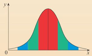
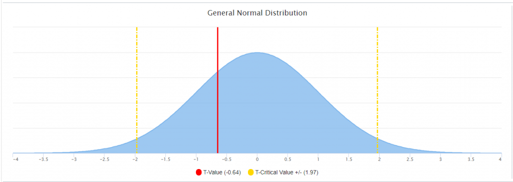
The following is an example when the means and SD were NOT statistically significantly different from the state population. Notice the observed score fell within the more likely observation or the center of the normal curve.
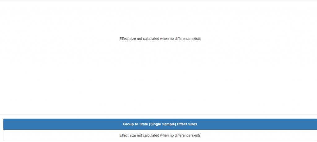
If no statistically significant difference exists between the means of the two groups, then the question, “what is the effect of that difference?” would ultimately yield no results. Therefore, the corresponding cohen’s d graph for this example would then appear as such:
In the following example there is a statistically significant difference between the means; however, that difference falls to the left of the normal curve in the negative un-likely observations or “rare” zone.
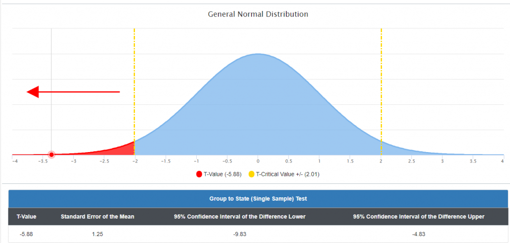
Since there is a statistically significant difference between the means, albeit negative, the following Cohen’s d is the result of the effect of that difference:
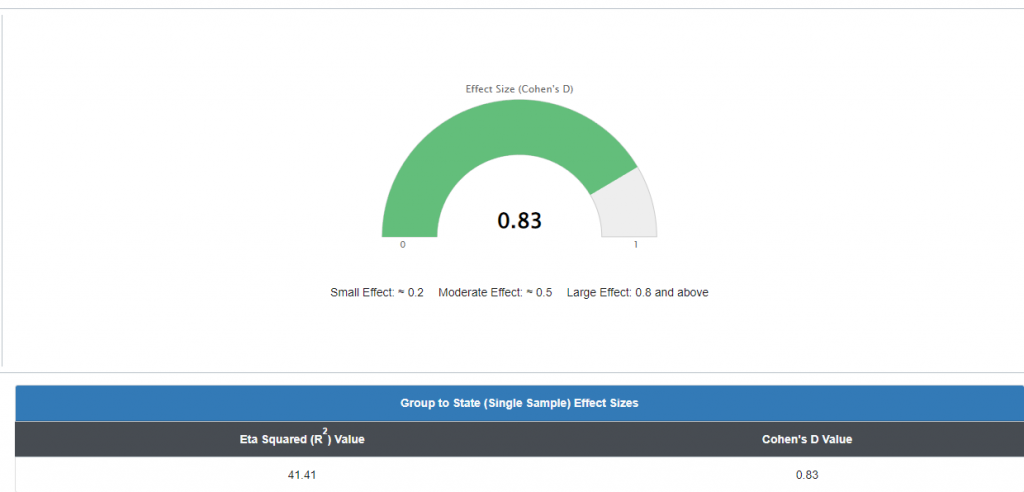
The previous graph is a perfect example of why an effect size calculation is required. The previous graph indicated a statistically significant negative difference between the sample and the population mean, but the Cohen’s d calculation indicated a d=.83 which corresponds to a large effect. The direction of the difference (negative) indicated the direction of that effect (negative).
NOTE: Impact or effect does not automatically mean or suggest causation. Other confounding or contributing variables or factors could alter the effect or the impact. It is up to the person reviewing the report to know and understand program implementation and identify confounding variables to best ascertain the level of the impact or effect.
Stephanie Glen. “Cohen’s D: Definition, Examples, Formulas” From StatisticsHowTo.com: Elementary Statistics for the rest of us! https://www.statisticshowto.com/cohens-d/