What This Chart Means for Your Classroom
As educators, we want our assessments to truly measure what our students know. The Question Quality Distribution chart shows us how well each test question distinguishes between students who understand the material and those who need more support. Think of it as a report card for your test questions.
Point Biserial Correlation: Your Question’s “Teaching Power”
Point biserial correlation measures whether your high-performing students are getting questions right while struggling students are missing them. When this works well, it means your question is doing its job – identifying which students have mastered the concept.
Simple Example: If your top students consistently get a question right and your struggling students consistently miss it, that’s a good discriminating question. If everyone gets it right or everyone gets it wrong, the question isn’t helping you understand who knows the material.
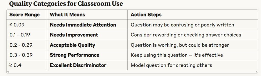
Reading Your Results: What Each Range Tells You
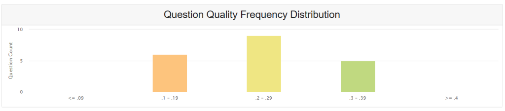
What Your Current Distribution Shows
Looking at your data:
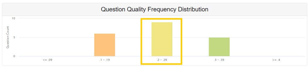
- Most questions (8) are in the “acceptable” range – they’re doing their job but have room for improvement
- Balanced spread suggests consistent question quality across your assessment
- No problem questions – nothing in the “needs immediate attention” category
- Opportunity for growth – several questions could be refined to reach “strong” or “excellent” levels
Practical Applications for Your Teaching
Before Your Next Test
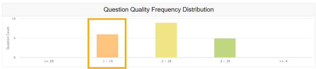
- Review questions scoring 0.1-0.19: Are the directions clear? Do answer choices make sense?
- Examine your highest-scoring questions: What makes them work well? Can you apply those techniques to other questions?
- Check question difficulty: Questions that are too easy or too hard won’t discriminate well between student ability levels
Item Analysis in Practice
Good Discrimination Example:
- Question: “Which equation represents a linear function?”
- High-achieving students: Most get it right
- Struggling students: Most get it wrong
- Result: Strong discrimination (good question)
Poor Discrimination Example:
- Question: “What is 2+2?”
- High-achieving students: Everyone gets it right
- Struggling students: Almost everyone gets it right
- Result: Weak discrimination (too easy to be useful)
Making Data-Driven Improvements
Quick Wins for Question Quality
- Aim for moderate difficulty – Questions answered correctly by about half your students often discriminate best
- Review wrong answers – Are students choosing the same wrong answer? Your distractors might need work
- Test your questions – Try them with a small group before the full assessment
Building Better Assessments
- Target most questions in the 0.2+ range for reliable measurement
- Watch for patterns – If multiple questions in one topic area score low, review your instruction in that area
- Balance your test – Include questions across difficulty levels while maintaining good discrimination
Red Flags to Watch For
- Questions everyone gets right or wrong – These don’t help measure learning differences
- Questions where your best students struggle but weak students succeed – May indicate confusing wording or incorrect answer key
- Consistent low scores across related topics – May signal instructional gaps rather than question problems
Moving Forward with Confidence
This analysis helps you create assessments that truly measure student learning and guide your instructional decisions. When your questions discriminate well, you can trust your data to inform your teaching and support student growth. Focus on building questions that challenge students appropriately while clearly distinguishing between different levels of understanding.
Remember: The goal isn’t perfect scores, but meaningful data that helps you understand what your students know and what they still need to learn.