Graph Creation
As reports are created you will begin to see graphical representations of the data in the window to the right of the screen. Initial data reports are defaulted to be for your district, state, and region and will not display Peer List comparison information in the charts until they have been selected. All assessment graphs are displayed as bar charts and all financial graphs are displayed as line graphs.
It is important to remember to select from the graph control section the year and demographic data you are looking for each time you create a new report.
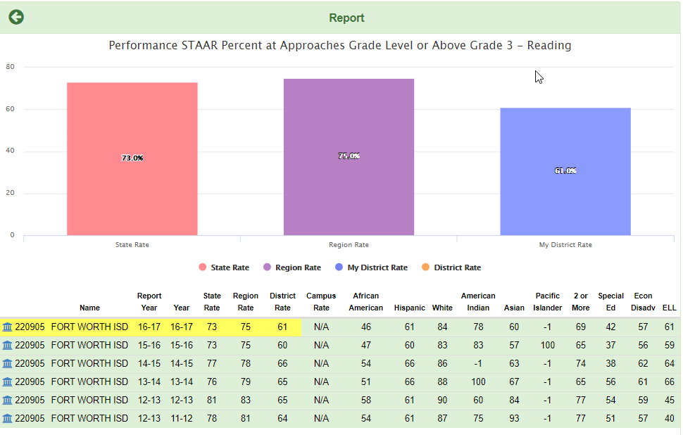
Assessment Graph Example
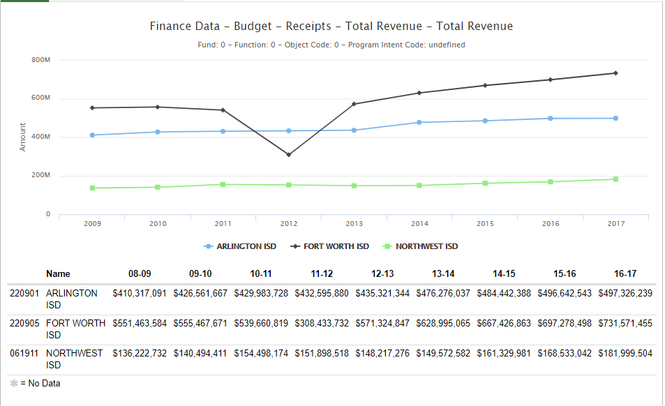
Finance Graph – Default Example
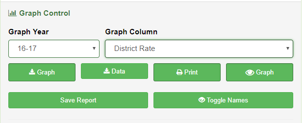
Using the OnPar Graph Control Selector Options
The final step in the creation of reports using the OnPar report builder requires the users to select the year they would like the results from and the particular demographic they wish to display.
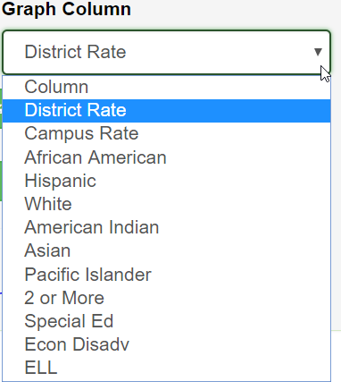
Demographic Display Options
All Demographic data is aligned with the TAPR report’s available selections and is dependent upon the initial selection criteria the user specified. Users that are not familiar with the released layout are encouraged to view their current state released TAPR file to determine what selections are available for display.
Example: The reporting of performance data allows users to select by Ethnicity whereas the reporting of BE/ESL does not.
Use your Graph Controls to Download, Print, Save Toggle Names etc…