What This Report Shows You
The STAAR Two Year Standard Score Comparison report is like a snapshot that shows how your students performed on their math assessments compared to all other students across Texas over two years. Think of it as a way to see not just how your students did, but how they’re doing relative to everyone else in the state.
How Student Scores Are Calculated
Instead of using raw test scores, this report uses something called “standard scores” or “z-scores.” Here’s how it works in simple terms:
The state takes every student’s score and compares it to the average score of all Texas students. If a student scored exactly average, they get a score of zero (not because they failed, but because they’re right at the middle). Students who scored above average get positive numbers, and students who scored below average get negative numbers.
Example: If the state average was 1500 and your student scored 1600, they’d have a positive standard score because they did better than average. If they scored 1400, they’d have a negative standard score because they scored below the state average.
Understanding the Visual Layout

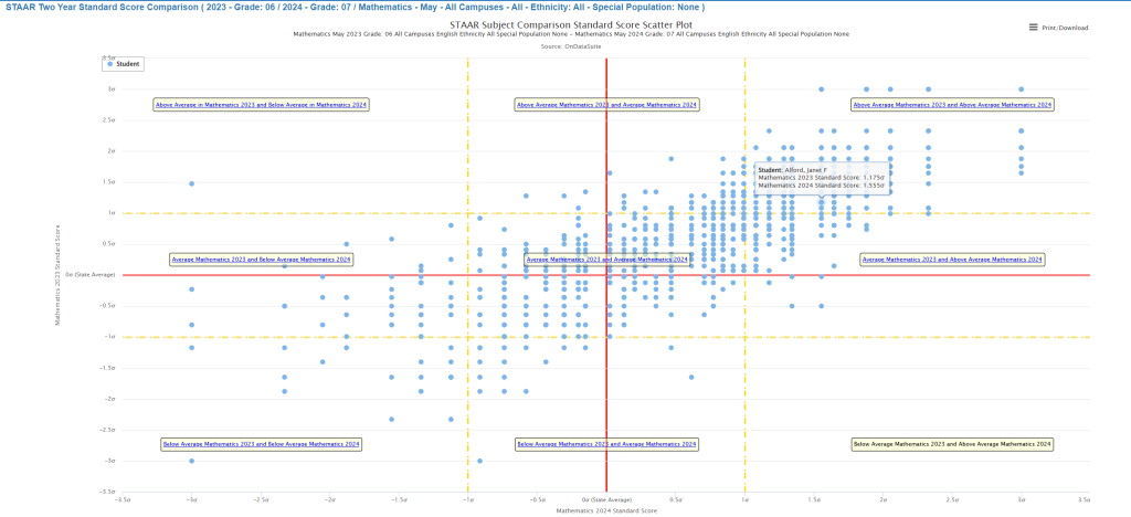
The Grid System
The report looks like a coordinate grid with two axes:
- Horizontal line (X-axis): Shows 2024 math performance compared to the state
- Vertical line (Y-axis): Shows 2023 math performance compared to the state
The Important Lines
- Red lines: These show the state average (the middle point)
- Yellow dashed lines: These mark one standard deviation above and below average – think of these as the boundaries between “average,” “above average,” and “below average” performance
Why Standard Deviation Matters
The yellow lines are important because they help you understand meaningful differences in performance. About 68% of all students fall between these yellow lines (the “average” range), while students outside these lines are either performing significantly above or below their peers statewide.
The Nine Areas: What Each Group of Students Tells You
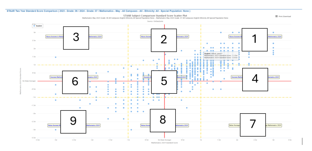
Top Row (High 2023 Performance)
Zone 1: Consistently High Performers (Top Right) Students who scored above average both years
- These are your consistent high achievers
- They may need more challenging work or enrichment opportunities
- Consider them for advanced programs or leadership roles in class
Zone 2: Declining High Performers (Top Center) Students who were above average in 2023 but average in 2024
- These students may be losing momentum
- Check in with them about motivation, engagement, or outside factors
- They might benefit from re-engaging strategies or goal-setting
Zone 3: Significantly Declining Performers (Top Left) Students who dropped from above average to below average
- This is your “red flag” group requiring immediate attention
- Look for changes in attendance, home life, or attitude toward school
- These students need intensive support and monitoring
Middle Row (Average 2023 Performance)
Zone 4: Rising Stars (Center Right) Students who moved from average to above average
- Celebrate these success stories!
- Figure out what worked for them and try it with other students
- Keep supporting their growth with challenging but achievable goals
Zone 5: Steady Average (Center) Students who performed average both years
- This is typically your largest group
- Look for small signs of growth within this “average” range
- These students often benefit from targeted skill-building and confidence-boosting
Zone 6: Slipping Students (Center Left) Students who dropped from average to below average
- Early intervention is key for this group
- They may need additional support before they fall further behind
- Consider extra practice, tutoring, or checking for learning gaps
Bottom Row (Low 2023 Performance)
Zone 7: Remarkable Turnarounds (Bottom Right) Students who jumped from below average to above average
- These are your biggest success stories
- Document what interventions worked for them
- Share these strategies with other teachers
Zone 8: Improving Students (Bottom Center) Students who moved from below average to average
- These students are making good progress
- Continue whatever supports you’ve put in place
- They may need sustained help to keep improving
Zone 9: Persistent Struggles (Bottom Left) Students who remained below average both years
- Your highest priority group for intensive intervention
- They may need special education evaluation if not already receiving services
- Consider comprehensive support including tutoring, modified instruction, or alternative strategies
What This Means for Your Classroom
For New Teachers:
Don’t be overwhelmed by all the data! Focus on these key questions:
- Which students need immediate help? (Zones 3, 6, and 9)
- Which students are showing improvement? (Zones 4, 7, and 8)
- What can I learn from the students who are succeeding?
For All Educators:
- Use this report to group students for targeted instruction
- Identify which teaching strategies are working (look at improving groups)
- Plan interventions for students who are struggling or declining
- Celebrate growth, not just high performance
Important Notes
- Only students who took both years of testing appear on this report
- The report shows relative performance compared to all Texas students, not just your school or district
- Small movements on the chart can represent meaningful changes in student learning
- Remember that this is just one measure – combine it with other classroom assessments and observations
Taking Action

Immediate Steps:
- Identify students in Zones 3, 6, and 9 for intervention support
- Celebrate and study the success strategies for students in Zones 4, 7, and 8
- Plan differentiated instruction based on these groupings
Long-term Planning:
- Use these patterns to inform your instructional planning
- Share successful strategies with your team
- Monitor student movement between zones over time
Remember, every dot on this chart represents a real student with unique strengths, challenges, and potential. This report is a tool to help you better understand and support each student’s academic journey.